
What font should I use? For what thing you should turn your attention during picking.
What font should I use? For what thing you should turn your attention during picking.
If you are a beginner, the font picking can seem to you the hard and timeless task to overcome. For many designers, it’s a mystifying process! And it’s no wonder why! There is an endless choice of fonts, beginning with variants that are more conventional and with some candy or sweet fonts!
There are so many variants and all of them are unique and exclusive. However, what font should you pick? Even for the skilled and experienced designer, this issue can become crucial much less amateur or beginners.
From the very beginning, it can seem that the picking the right font for your future design it’s only the taste preferences, but this statement is wrong. The picking the right font is the mix of stick rules and the little bit of your intuition! You will find the perfect balance only after several years of experience!
We have prepared for you five recommendations that will help you to make the right decision and opt the perfect font for your future designs without distressful hesitation. Let’s look at the main principle of font picking:
- Opt the perfect font for the occasion. It’s a significant fact which you must to bear in your mind before picking the font. Many beginners make the general mistake – they try to show their personality and uniqueness and start searching for the most unique and creative font. But picking the font is like picking your dress, it must be appropriate to the specific occasion. So if you are going to make some elegant poster, for example, do not try to add some bright and candy font to it. After several months or years of work, you will determine your favorite font, which you will use constantly.
- Learn the fonts grouping. If you want to use more than one font in your future design, you will need to learn the families of fonts. There are many kinds of fonts but we determine the main five groups:
– Geometric sans
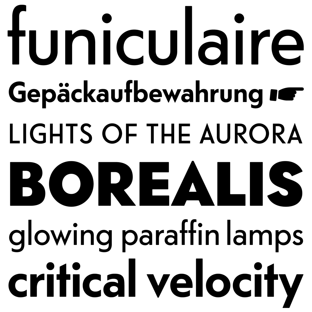
– Realistic
– Grotesk Sans
– Humanist
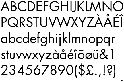
– Old style
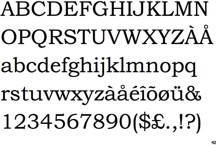
– Transitional
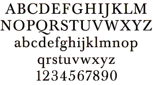
– Modern
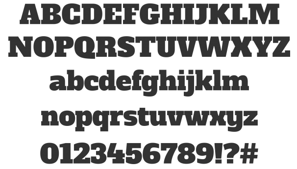
– Slab Serifs
- Remember about the rule of total correspondence or high contrast. When you start adding new typeface to your design, remember that it must be the same or create the great contrast! It means that your typefaces. You typefaces must be very different or look the same. Both of these variant works great! You can pick any of the approaches depending on what result you want to achieve. Just avoid small and wimpy difference; it can make your clients be frustrated and confused. You can create a great contrast not only by using the totally different font but with changing the size or weight of the font.
- Each design has its own direction and personality and each designer want to add some special, specific and unique element in each of them! However, remember about the dose. You can add some personality in font style but do it in the right balance. Don’t overload the design with a lot of creative fonts and approaches, add just some highlights!
- And the last rule. Create your designs like there is no rule at all! Yeap, it seems ridiculous but, it’s a creative part of designers work and you can forget about the rules for a little bit and make something unique maybe it will work better than design, which was made under the strict rules!
Of course, you can bear in mind our advice or do what you want. However, we remind you that we can offer you a great selection of different text styles and effects! You can determine what you need and then embellish your general font with the sparkling effect or frozen look! Remember our first rule – it’s all about the occasion and the style of your future design. Just start work with one font you love the most and then experiment with some other more creative and untraditional variants. In addition, you can just change the font looking by adding some effect, we have written about it higher.
Now you can opt some gorgeous text styles for your designs! Start scrolling our categories and happy picking.
Not exactly what are you looking for? Check other our Photoshop actions!


has been added to your cart